
Chart#
The chart renderer is used display aggregate results such as trends, quantities, counts, and other numerical data. Charting will plot an enumerated value with an optional “by” parameter. For example, if there are counts associated with names, chart count by name will chart a line for each name showing the counts over time.
The chart render module is a condensing module that collapses and recalculates data in order to show an accurate representation of data for a given timespan. As you dig into data and zoom in, the chart renderer is constantly re-condensing the results of a search without rerunning the query.
Sample Query#
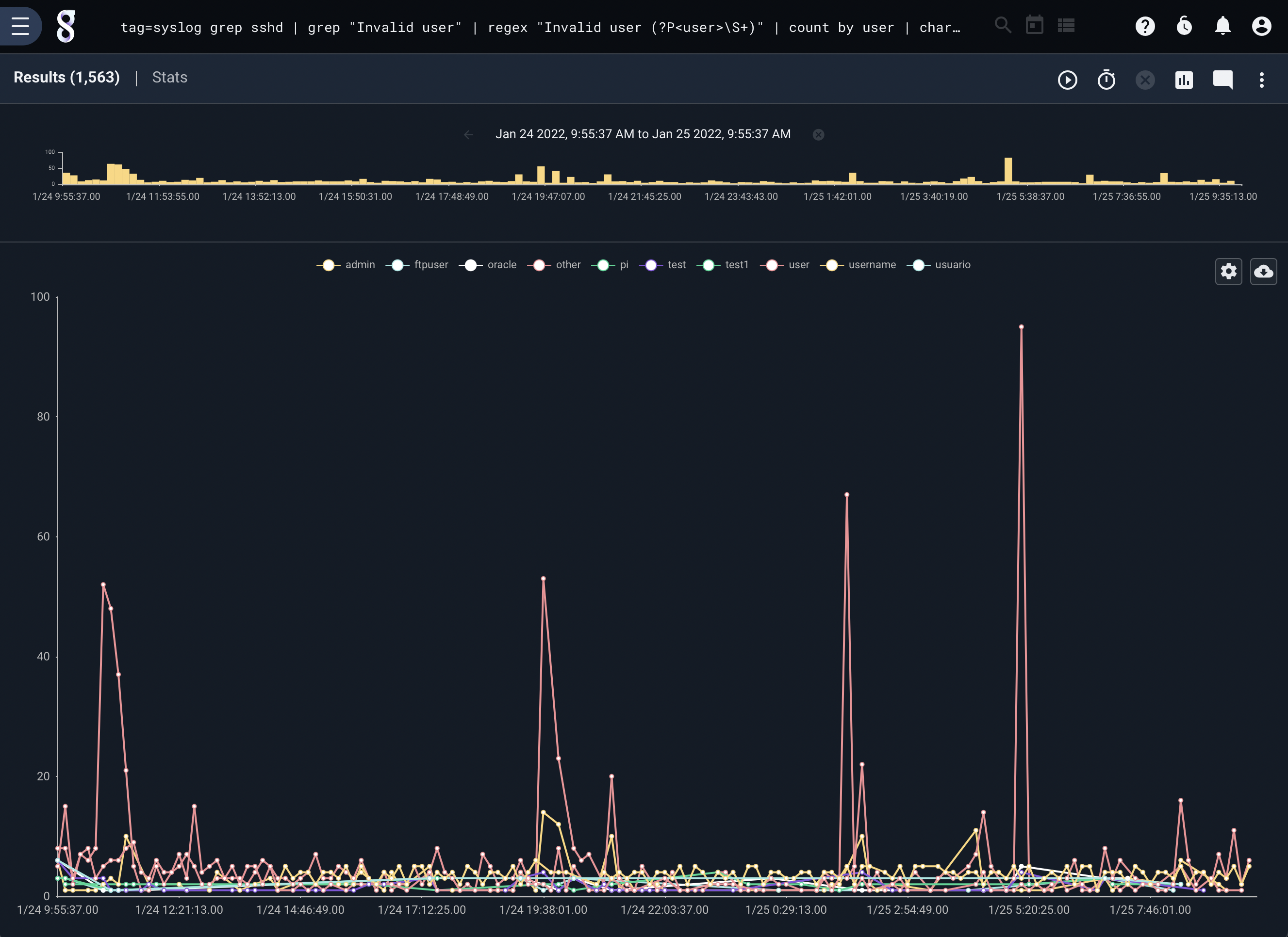
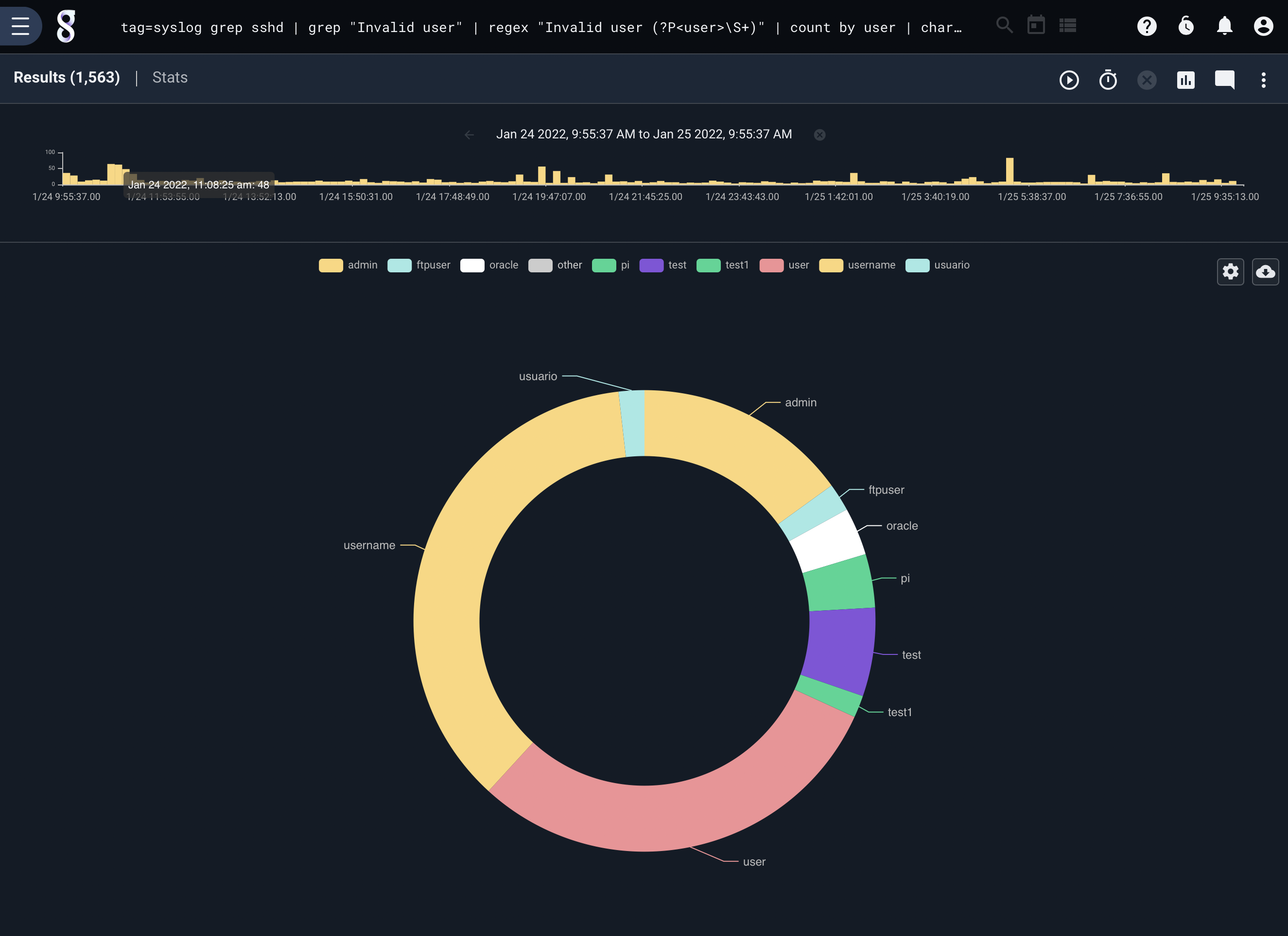
The following query generates a chart showing which usernames most commonly fail ssh authentication; due to online brute-forcing attacks, we can expect “root” to be the most common.
tag=syslog grep sshd | grep "Failed password for" | regex "Failed\spassword\sfor\s(?P<user>\S+)" | count by user | chart count by user limit 10
Charts with Keys#
The chart renderer can produce data sets based on keys. In the above examples we are plotting the count of entries using the key user which produces a count for each user user. Chart supports multiple keys, which would allow us to chart data using the intersection of multiple key values. For example we can run a query that calculates the size of data for each IP and Port using PCAP. The query and results would be:
tag=pcap packet ipv4.IP ~ 192.168.0.0/16 tcp.Port | length | stats sum(length) by IP Port | chart sum by IP Port
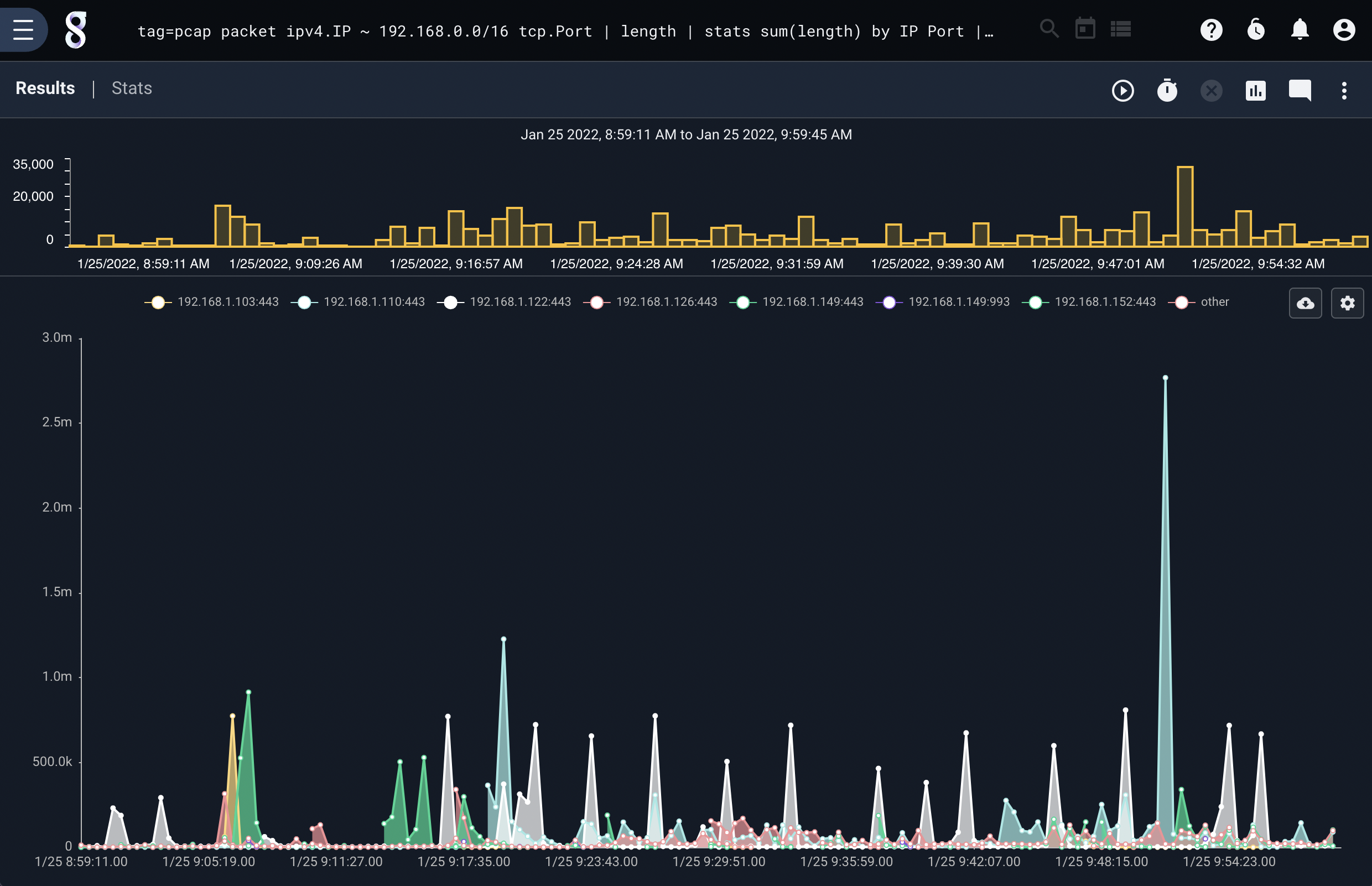
Notice that chart generated a legend with the IP and Port concatenated, the key for each sum is the intersection of the IP and Port.
Multiple Chart Categories#
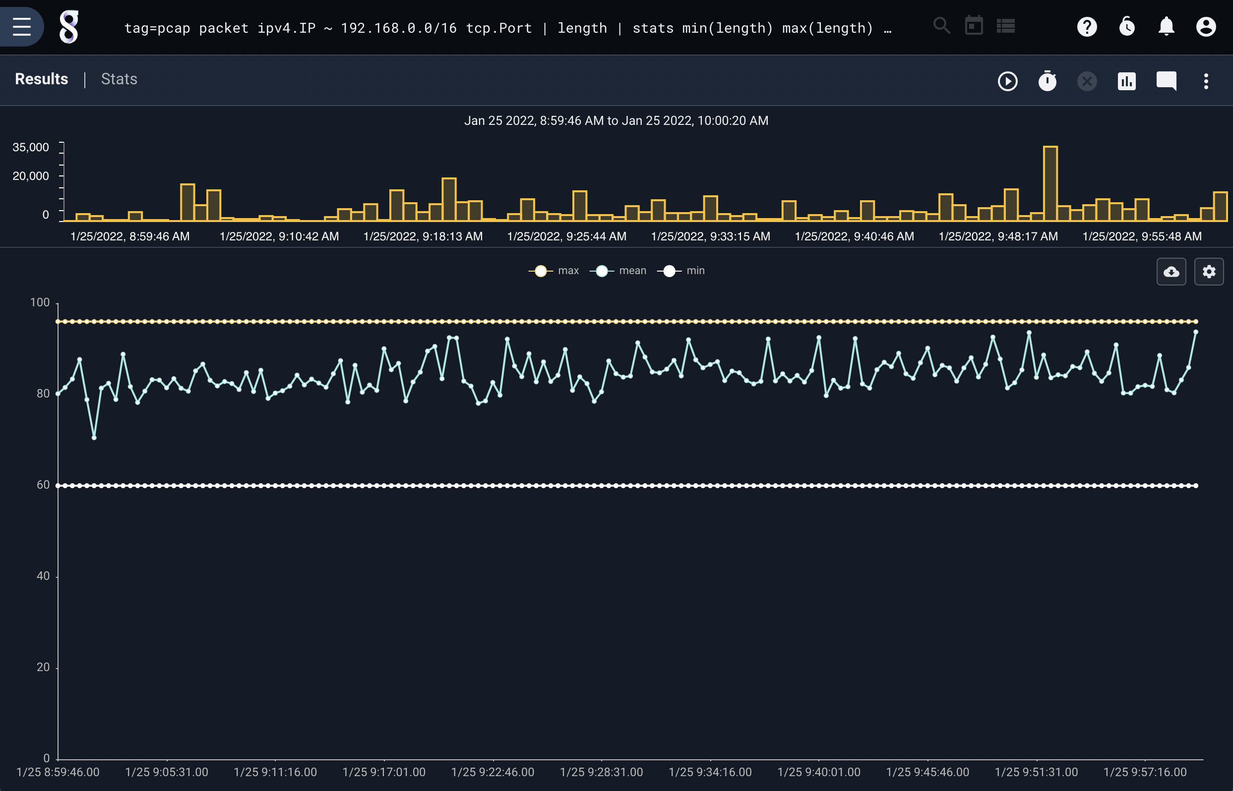
The chart renderer can also plot multiple independent data sources–for instance, we might want to plot the min, max, and mean of a stream of data. The following query generates the min, max, and mean of packet lengths over time and displays the results on a single chart:
tag=pcap packet ipv4.IP ~ 192.168.0.0/16 tcp.Port | length | stats min(length) max(length) mean(length)| chart min max mean
Note
Multiple value types on a single chart are called categories.
Charts can use multiple keys and categories, it is perfectly acceptable to plot the min, max, and mean using a set of keys. This query plots the min, max, and mean of packet sizes using the IP and Port keys. The chart can get a little busy, but the output can still be useful.
tag=pcap packet ipv4.IP ~ 192.168.0.0/16 tcp.Port | length | stats min(length) max(length) mean(length) by IP Port | chart min max mean by IP Port
Intelligent Keying with Multiple Categories#
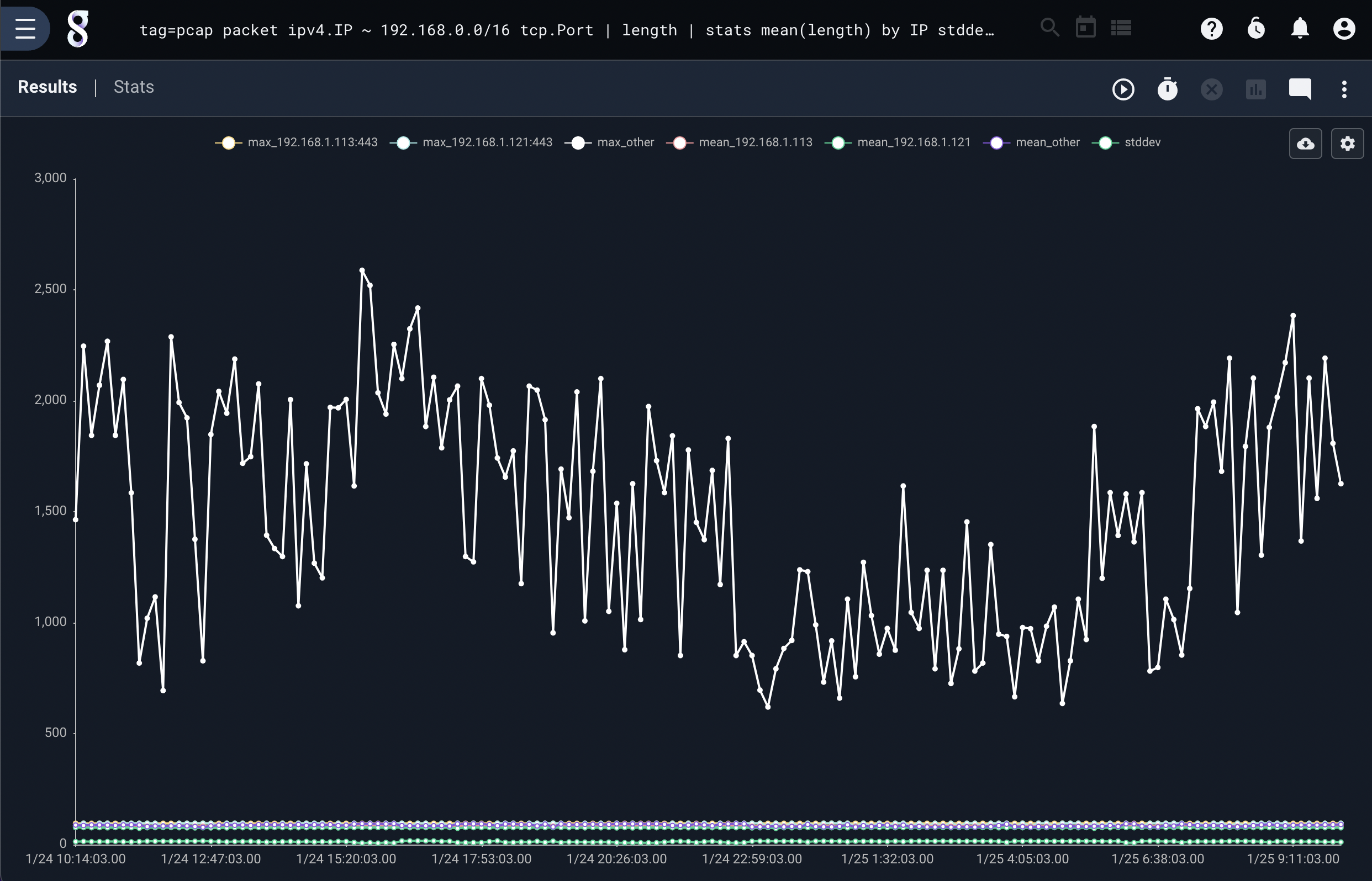
The chart renderer utilizes the Gravwell pipeline to decide how to key and condense multiple categories. It is intelligent enough to identify the correct keys that generated a data category and condense using those keys. This allows us to generate very complex charts with multiple categories that do not have uniform key sets. For example, maybe we want mean packet sizes for each IP, but we want the standard deviation of packet sizes for everything. This can be accomplished using the following query:
tag=pcap packet ipv4.IP ~ 192.168.0.0/16 tcp.Port | length | stats mean(length) by IP stddev(length) over 1m | chart stddev mean by IP limit 3
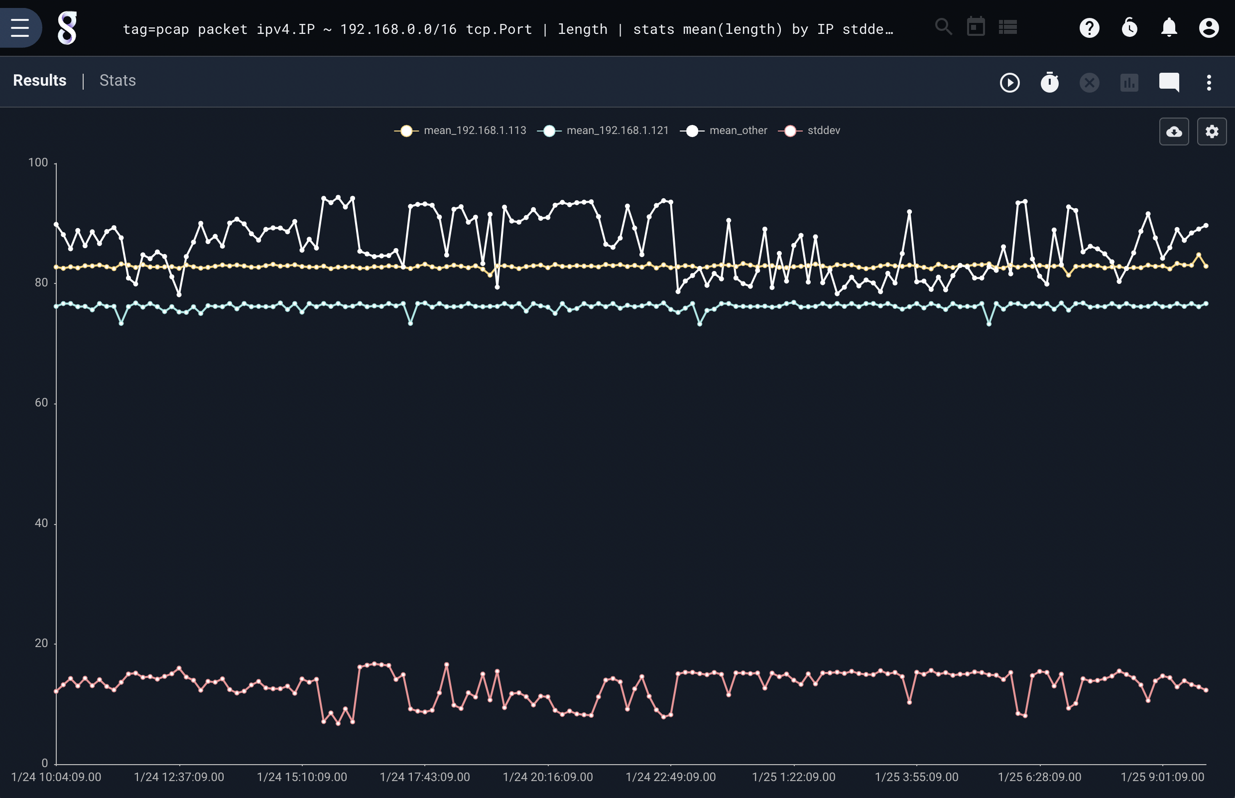
Chart can handle even more complex category and key interactions, here is a query that plots the mean of packet lengths by IP, and the max packet for each IP Port, and the standard deviation of all packet lengths.
Note
Notice that we provide all the categories and a single set of keys that covers all keys used for the categories. Chart will figure out which keys go to which category and do the right thing.
tag=pcap packet ipv4.IP ~ 192.168.0.0/16 tcp.Port | length | stats mean(length) by IP stddev(length) max(length) by IP Port over 1m | chart stddev max mean by IP Port limit 3
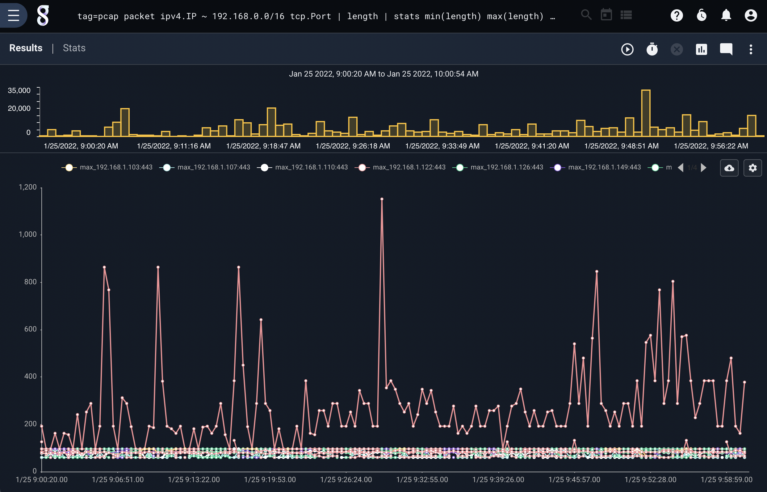
Chart Limiting and Grouping#
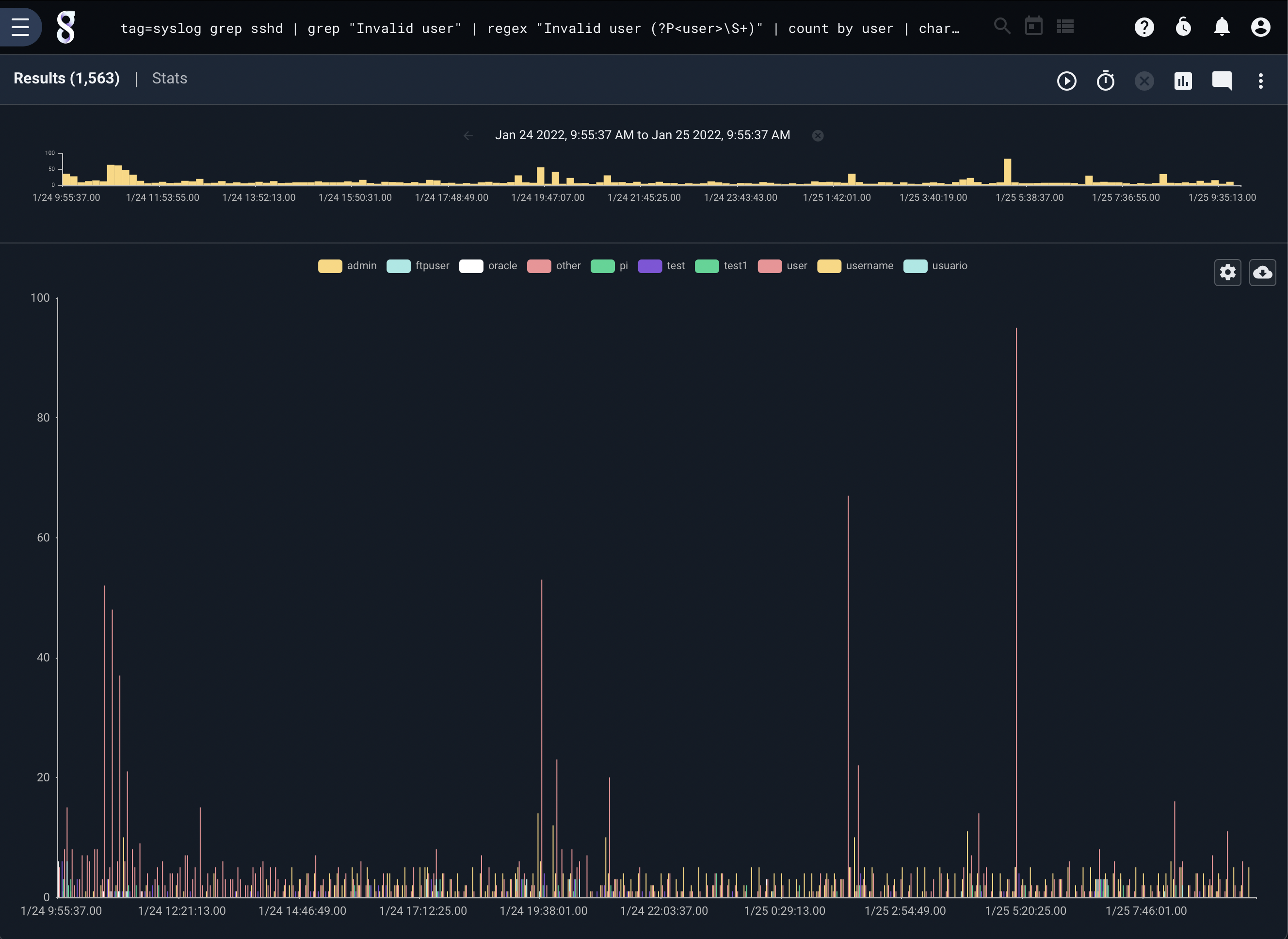
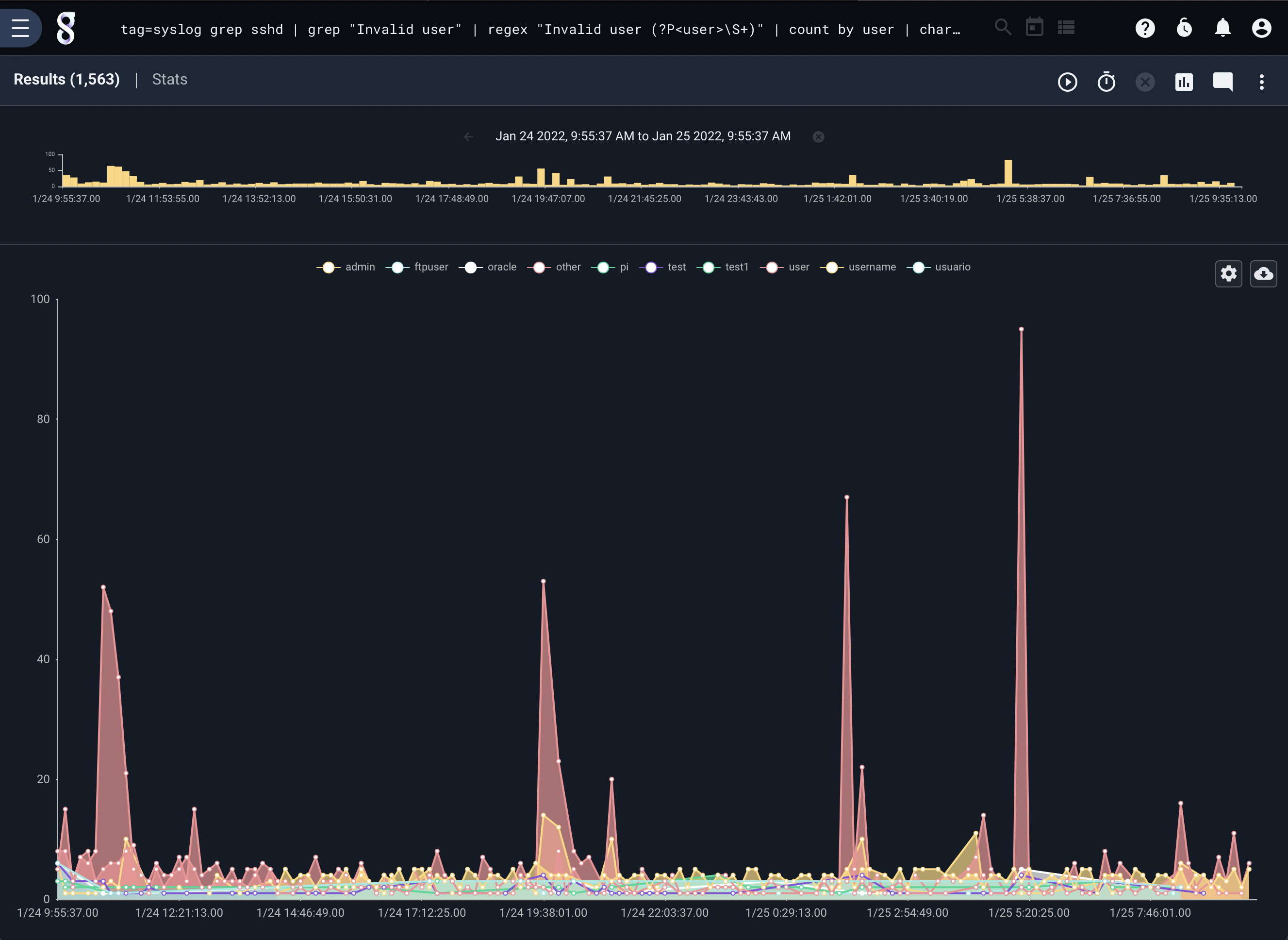
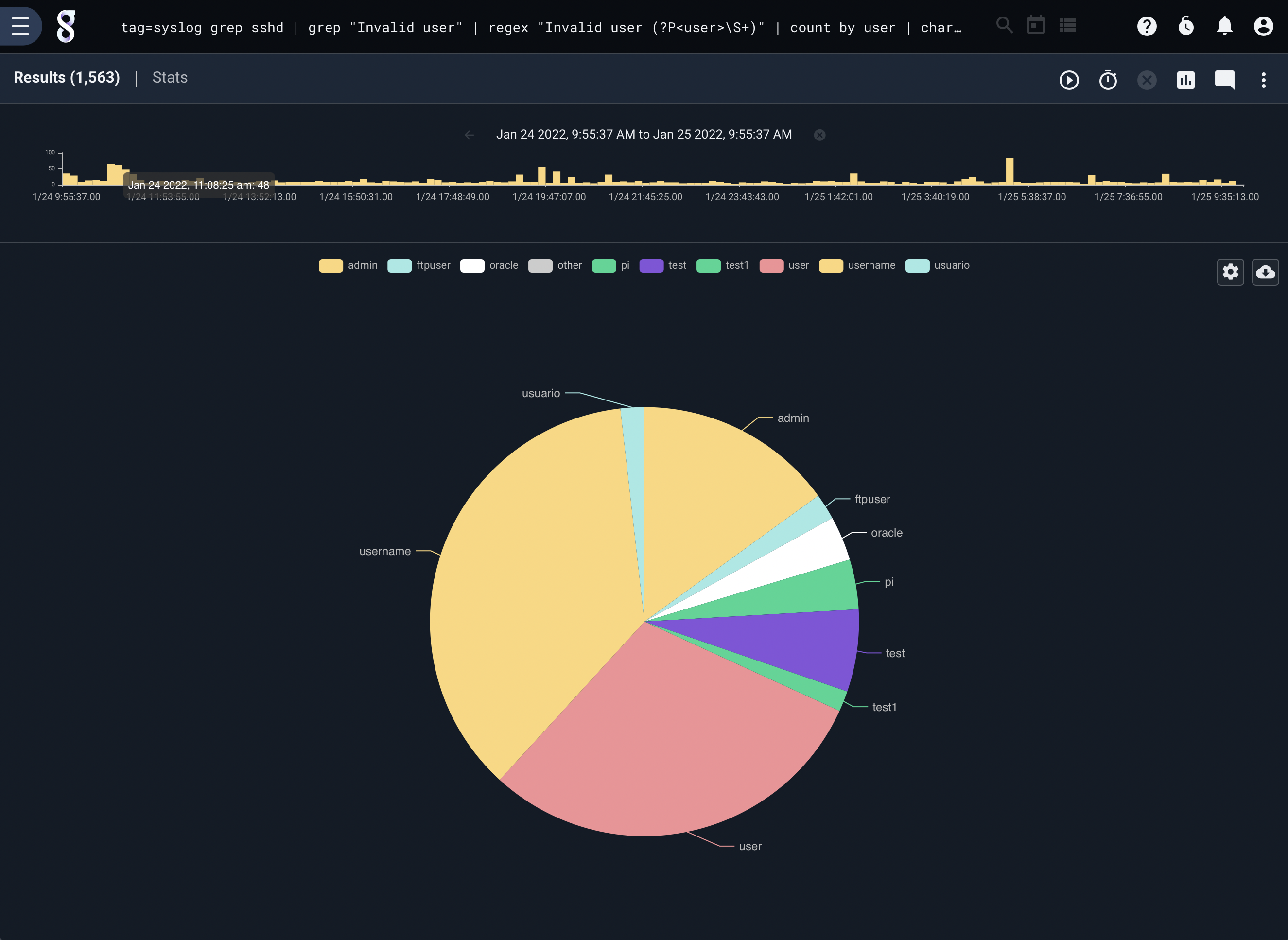
The user interface for charting allows the user to switch rapidly between different chart styles (line, bar, pie, etc.). The charting renderer will automatically limit the plotted lines or bar groups to 24 values. If you would like to see more lines or fewer lines, you can add the limit <n> argument which tells the charting library to not introduce the “other” grouping until it reaches the given limit of n values. If there are more groups than the allowable limits, chart generates an other group that is comprised of everything not in the displayed groups. The limit maximum specifies the total number of data sets for a category; if the limit is 4 there may be 3 keyed sets and 1 other group.
The chart renderer runs a pre-scan at the beginning of every query in order to determine which data sets will be drawn and which will be grouped into the other group. Chart will scan until either 1/3 of the query timespan is covered, or it receives enough data to make a decision. If multiple data sets are being drawn, chart creates an other group for each category of data if needed. For example, if we were running a query with the following chart parameters chart foo bar baz by X there might be three other groups, one for each category foo, bar, baz.
Example Other#
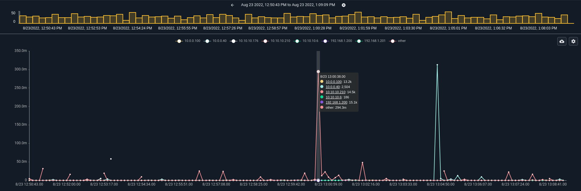
Consider the query tag=netflow netflow IP~PRIVATE Bytes | stats sum(Bytes) by IP | chart sum by IP limit 8 where we sum up the total bytes per private IP in netflow records and chart it. Even small networks will contain more than 8 hosts, which means that the chart module will create an other bucket. Here is how that query looks:
We can modify the query to allow for more data groups by appending the limit keywords tag=netflow netflow IP~PRIVATE Bytes | stats sum(Bytes) by IP | chart sum by IP limit 32. Note that there are many more data groups in the chart, but overall the chart does not look substantially different.
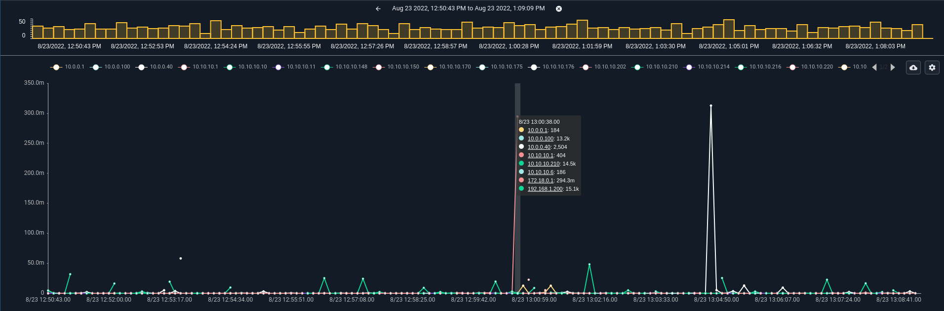
The “other” bucket calculates results and generates an output using the same math as other data buckets. This means that if you had 1000 IPs all creating about 1KB/s of data then the “other” data set will be substantially larger than the other lines because it is the summation of 993 IPs. This is to say that an “other” bucket is properly calculated using the same math as named data buckets and not just a mean of all other outputs.